Healing Our World
Glowing First Impression
When Healing Our World magazine expressed that they wanted to increase their readership so more people would know about their innovative lifestyle programs, we knew a magazine redesign was precisely what the design doctor ordered.
With global circulation exceeding 100K which now includes dynamic nationally recognized distribution hotspots such as Whole Foods, our magazine identity redesign instinctually focused our efforts right where it mattered most - establishing those once in a lifetime, impactful first impressions.
Elevated Engaging Design
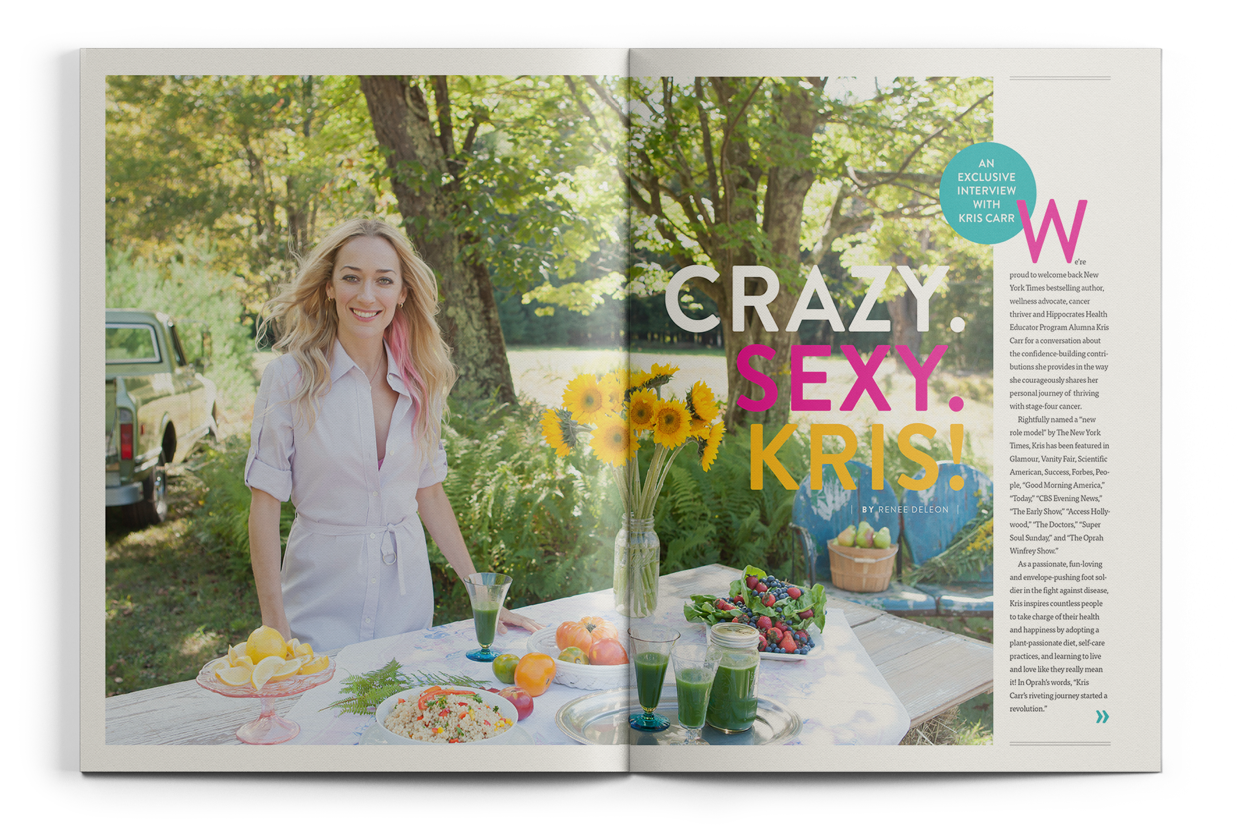
Knowing we wanted to be sure to communicate that this particular uplifting story was something too good to miss, we showcased our exclusive interview with New York Times bestselling author and cancer thriver Kris Carr, with eye-catching, beautiful, fluid editorial design.
By playfully emphasizing words of a title with whimsical, bold colors while skillfully finessing typography in a way that allows it to effortlessly bounce off a background and invite the reader to sit down and stay for lunch, award-winning design leaves tasty editorial content, wholeheartedly devoured!
Healthy Bottom Line
Immediately after the launch of our redesign of Healing Our World magazine, advertising revenue increased by more than 300%. During our year of producing this quarterly journal, each following issue delightfully had an ad space status of sold out.
Not only that, advertisers wrote testimonials to attest to their success after having advertised their product with the redesigned, Healing Our World magazine. When is the last time your sponsors offered that kind of support? The publisher responded as you might expect; time to increase the page count!